
Mobile App Re-Design

Soundcloud
Mobile app re-design
Social music streaming
Soundcloud is a social music streaming service focused on the artist. Users can share music and upload their own songs to share with the community. Total users including paid subscribers and free listeners are estimated at 175+ million.
With such a large estimate, what makes Spotify and Apple Music services so popular—claiming 50 million and 27 million paid subscribers?
Approach
Navigating Soundcloud is not as intuitive and clear as its competitors. There are a few more steps when registering for the first time, and using it as a free listener does not educate the user the options you get with a paid subscription.
Design proposals
Re-design subscription process to educate new users.
Simplify key screens and workflows that are confusing.
Design for consistency across application.
Design playlist layouts that are consistent throughout app.
Reduce steps to complete a task.
Goals
Educate - Providing a break down of subscription levels during the sign up process for new users, will explain the benefits of being a subscribed member, without adding extra steps to complete.
Increase the conversion rate from free listeners to paid subscribers.
Cutting down on steps - to accomplish tasks will enhance the experience of finding and playing tracks.
Simplify - too many elements and icons to learn on every screen. Users can get lost and frustrated, leaving the app.
Adjust patterns - and standardise the navigation bar so that they’re consistent throughout the site, finding tracks and organizing playlists will be come for fluid—improving the usability of the app.
Consistency - the navigation bar is constantly changing with each screen and switching positions of icons. Layouts are not consistent and hard to search through.

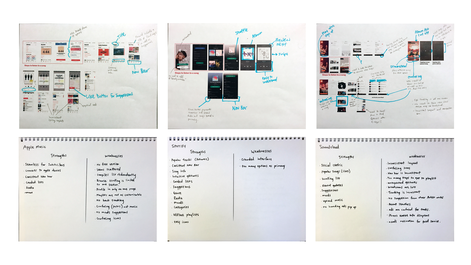
Apple music evaluation
Nice breakdown of options
Can’t use for free without starting a trial
A lot of red, should be reserved for alerts
Current song stays at the bottom while exploring
Consistent navigation bar

Spotify evaluation
Motion background
Easily sign up
Easy to understand controls
Full album graphic and small preview affords swiping
Current song info stays while exploring the app
Consistent navigation bar

Soundcloud evaluation
Unfamiliar icons
Inconsistent navigation bar
Inconsistent titles
Album art gets cut off
Changes in bottom icons
Need to press here to keep exploring but also pauses the song and introduces a new icon.
Status bar changes and album art disappears, confusing the user
Wasted space, and hides repost button
App features
Further use of these apps gives us a list of strengths and weaknesses for each.
Points to consider
Behavioral insights show Apple and Spotify are the services users are debating over the most.
How can Soundcloud be a part of the conversation?
Complaints of UI and confusion lead to bad UX for the customer.
Make navigating Soundcloud as easy or better than its competitors.
Refresh the Interface with more natural learned experiences that have been normalized within the mobile platform. (i.e.: icons, gestures, terminology, content flow)
Soundcloud also offers social aspects like user uploads which Spotify and Apple Music don’t support.


Patterns/Icons
Back button
Social buttons grouped with options
Track animation
Recognizable controls
Organized options list

Browse screen
Status bar
Full album covers
Scroll left and right
Scroll up and down
Static secondary nav bar

Sign up process
The first screen gives new and returning users all the options at the beginning. They can create an account, sign in, listen for free right away.

Adding to playlist
Options button
Album graphic to confirm song
All the users playlists displayed
Confirmation


